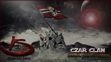
thanks Vayman!
Once again, I fully support the last version of your text.
Im just failing to incorporate it into my versions of the loading screen. The text may still be slightly modify to fit perfectly with Rogue One novelization. /methink we need a reference to it.
I love to make indirect reference to whats gonna happen next.
Im gonna try to make 2 more versions of the same loading screens, combining them. I really appreciate the feedback. I prefer colloborative works to competitive destruction.
Whoever wins, the sooner more content is delivered into our game, this is our victory.
PS: I did like Vayman new colors for the loading screens, in fact i love it.
My only problem with it is that atm is that it fits well only with my first loading screen.(with that one its great)
Its the one vayman calls "Fall of the Jedi"
It does not do well with the one i'd call call "survival of the force"
Problem: it kills the Old Man (as he normally appears in transparency, i must remove the transparency and then it creates unneeded problem reading the text)
We are saturday 9:39 am Western Europe Time. i'll have something for tonight.
Edit:
@frightman:
Welcome to the club.
i spent many many hours on my loading screens and then I failed to post them. Googledrive only gave me links that are https. I thought this was the problem so I switched to imgurs.


 Reply With Quote


